
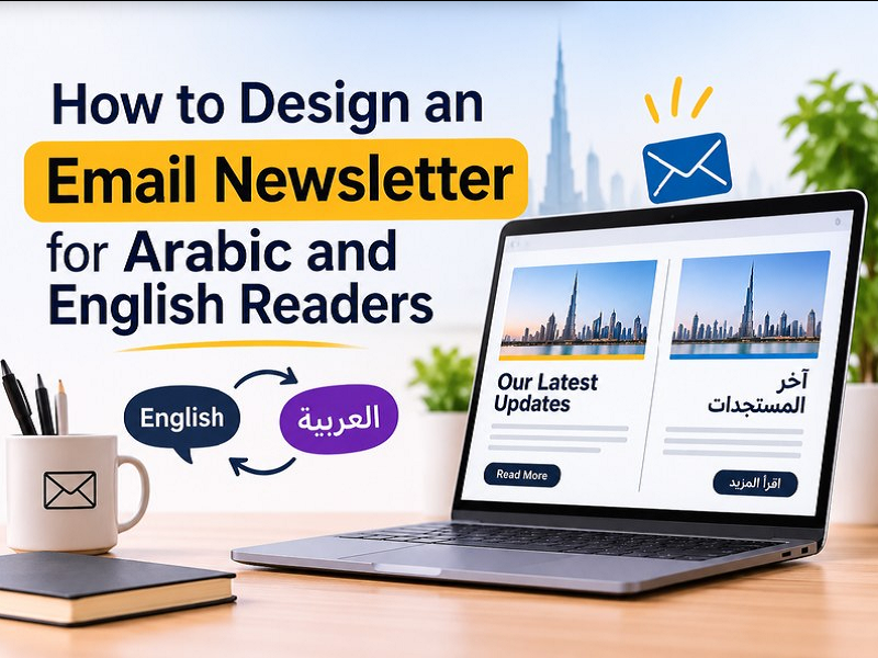
How to Design an Email Newsletter for Arabic and English Readers
You write a newsletter, read it over, and hit send. A few days later the numbers look flat, and the writing may not be the reason. Readers decide in a few seconds, and a long block of text, small fonts or a button they have to hunt for can end it early.
Design in email is mostly about making things easy to read and easy to act on. It does not take fancy graphics or a design degree. This post covers the basics, from layout and fonts to buttons and mobile screens, plus what changes when readers use both Arabic and English.
What Is Email Newsletter Design?
Think of a newsletter you read to the end. The writing helped, but so did the way it was set out. Where the eye landed first, how the text was spaced and which button stood out all shaped that. That arrangement is email newsletter design.
What it covers
- Layout and spacing, which set the reading order
- Fonts and colours, which affect readability
- Images and buttons, which support the message
It is separate from writing the copy. It also has tighter limits than a web page, since every inbox displays an email a little differently.
How to Set Up a Simple Layout
Set the content width to around 600px which is a common standard for email. It fits most preview panes without side scrolling and stacks into one column on a phone.
Top to bottom, the order rarely changes. Logo and header come first. Then the main thing you want readers to know along with supporting items such as a second article or an offer. Finally a footer with contact details and the unsubscribe link.
| Layout | When it makes sense |
| Single column | Most newsletters, especially if readers open them on phones |
| Two columns | Two products side by side, as long as they stack on mobile |
| Hybrid | A longer issue with one full-width story and a small grid below |
Leave space around buttons and paragraphs. Fitting more on screen is no help if it is harder to tap.
Which Fonts and Colours Work Best
Plain choices tend to work best. Stick to one or two fonts, and pick ones that email clients support everywhere, such as Arial, Verdana or Georgia. Fancy script fonts may look good in a design tool but often fall back to something else in the inbox.
A few rules cover most of it:
- Body text at 16px or larger, so readers on a phone don’t have to zoom
- Loose line spacing, so paragraphs don’t feel packed together
- Dark text on a light background, or the reverse, with a clear difference between the two
For colour, the 60-30-10 split is a handy starting point. Use a neutral for about 60 percent, your main brand colour for 30, and an accent for 10, mostly on the button.
How to Keep Your Branding Consistent
Readers should be able to recognise your newsletter at a glance. Keep the logo in the same spot, use the same colours and fonts every issue, and keep the tone of the writing steady.
A one-page style guide makes this easy. It only needs your colour codes, two fonts, the button style and the logo size. Save the layout as a template and reuse it, so each issue starts from the same base.
The newsletter should also sit well next to your other material. A business that has already done company profile design Dubai has its colours, fonts and tone decided, so the newsletter can borrow from that document instead of starting fresh.
Where to Place Calls to Action
Pick one main action for each email and put the button right after the part that explains it. A reader who has just seen your new service page or brochure is more ready to click than one who has only read the header.
Write the button text so it says what happens next. “Download the brochure” button is more likely to be pressed than “Click here” button. Make the button big enough to tap with a thumb and give it a colour that stands apart from the background.
Repeat the same button once near the end for a long email.
Why Accessibility Matters on Mobile and Other Devices
Most people check email on their phones, so that is where your newsletter should be tested first. Open a draft on your phone before sending. Text that looks fine on a laptop can end up too small, and a button can sit too close to a link.
Accessibility is mostly small habits, and they help every reader, not only those with a disability.
- Add alt text to images, so the message still makes sense if they don’t load
- Write link text that says where it goes, like “See the full menu” instead of “here”
- Keep enough contrast between text and background, especially on buttons and coloured sections
Check it in more than one email client too, such as Gmail and Outlook, since each can display the same email a little differently.
How to Design for Arabic and English Readers
Arabic reads from right to left so translating the text is only half the job. The layout needs to mirror too. Text aligns to the right, the logo and images move to the other side, and an arrow that means “next” should point left.
If one email carries both languages, test it before it goes out. Right-to-left text can break in some email clients, leaving lines jumbled or out of place. Send test copies to Gmail and Outlook, and read the Arabic on a phone to check the font stays clear at body size.
Template, Tool or Designer: Which One to Use
The answer depends on how often you send and how much your brand needs to stand out.
A ready-made template in Canva or Mailchimp is enough for a small list and an occasional send. You add your logo and colours, write the content and hit send.
A designer makes more sense when you send often or need both Arabic and English versions. A Newsletter Designs service can build one custom template around your brand and your team reuses it every issue instead of rebuilding the layout.
Common Newsletter Design Questions
How long should an email newsletter be?
There is no set length. Readers usually scan so one main message with a few clear sections can avoid that never-ending scroll. For longer issues, short headings help people find their part.
How many images can be used in an email newsletter?
Enough to support the message. Some email apps block images by default so the email should still make sense without them. Compress files so the email loads quickly on mobile data.
What should go in the footer?
Your business name, contact details, social links and an unsubscribe link that works. Keep the text small but readable, and use the same fonts as the rest of the email.
Does dark mode change how a newsletter looks?
It can. Some email apps invert or adjust colours automatically, so a logo with a white background may show up as a box. Use a logo with a transparent background and check a test email in dark mode.
Can I reuse my company profile artwork in a newsletter?
Yes. The logo, colours and approved images from a company profile design in Dubai can carry over. Export web-sized copies first, since print-ready files are heavy and slow to load.
Start With One Small Change
Next time when you open a blank draft visualise it from the reader’s perspective. Ask yourself if there is any place for the eye to land first. Also think about whether it still makes sense on a phone held in one hand with slightly distracted focus.
You don’t need to redo everything at once. Pick one small thing to fix in the next issue, whether it’s the width, the button or the font size, and see how the email feels when it lands in your own inbox.
Newsletters get better a little at a time. The next one you send can be easier to read than the last.
Get a free quote for a custom newsletter template

Amira Al Hadi is a senior creative strategist at LogoDesigner.ae with a deep passion for visual identity and modern brand storytelling. She loves to work with startups, SMEs, and established businesses across the UAE, she understands how powerful design can shape perception and drive growth. From minimalist logos to complete brand identity systems, Amira combines cultural awareness with global design trends to craft meaningful visuals.
In her articles, she shares practical guidance on logo psychology, color theory, typography choices, and rebranding strategies tailored for the fast-paced UAE market. Her goal is simple: to help business owners understand the “why” behind great design so they can build brands that look professional, memorable, and future-ready.