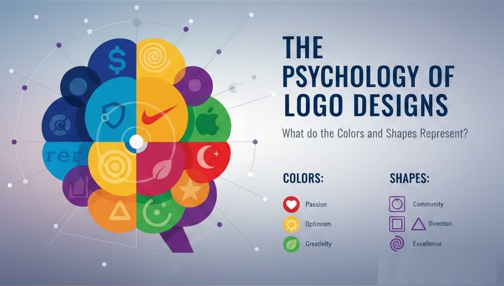
The Psychology of Logo Designs: What do the Colors and Shapes Represent?
The designing and the creation of a logo design is not an easy task. A graphic designer has to take into account what will the design actually represent. When deciding which color or shape to use as part of the Logo design, the response and customer reaction have to be kept in mind. A Logo Design aims to attract and speak to individuals. A lot of strategic thinking and planning is required when deciding which color or shape to use. Thus, it is vital to understand the psychology of logo designs when creating a unique and exquisite organization logo.
Logo Psychology and Color
The human emotions are normally triggered by various colors. The colors tend to speak a language and portray a hidden meaning. It is important that every organization chooses its logo color wisely as the color will represent the personality of that particular brand. The colors can psychologically influence our mind and feelings. Such as some colors might make one feel gloomy or depressed while other colors can make one feel energetic or calm. Thus different colors are used by companies as part of their logo design process which represents the meaning behind their brand.
Yellow represents a happy emotion. It can make one feel enthusiastic, adventurous, and be full of life. Red grabs the attention of individuals. It can have two hidden meanings; firstly it can give a feeling of warmth, comfort, or love. Similarly, a dark red color can portray anger so something that is wild. Black represents seriousness or cleverness while the white gives a hidden meaning of innocence, perfection, and cleanliness. The color brown and grey is used by brands to represent the outdoors or atmosphere. These colors can give a friendly and natural vibe to the individuals. The color purple personifies royalty and at the same time creates the essence of mystery. Pink, on the other hand, is used by brands to show compassion, love, and sophistication. A number of brands use blue in their logo designs that represent serenity, calm, high quality, and honesty. Lastly, green is used to represent health and at the same time, money as well.
Logo Psychology and Shape
One might be looking at various shapes at all times but may not give them much importance. However, our mind responds to the shapes that we see. Just like colors; shapes are also an important aspect when a logo is designed. Shapes tend to illustrate an idea and communicate with the person looking. They symbolize an idea and create various emotions and moods. Henceforth they tend to speak and connect with us in-depth. Similarly, they can represent strength, trust, and unity and give a positive or negative vibe.
More than 50% of the brands opt for the circular shape when designing their logo. Rings or circles represent commitment and integrity while other brands use circles to represent unity and stability. Such shapes are used by marriage bureaus, the Olympics, or organizations like NASA. Squares are a very popular shape as well. They represent privacy and security, such as housing and insurance programs use squares as part of their logos. They give a sense of safety and trust. Squares and rectangles are used by companies as part of their logo design to tell a story to the consumers. The brand Lego uses squares to convey their story so that the consumers (parents) are ensured that the products are fun and safe to play with. Out of all the shapes; triangles are not widely used by brands. Whenever one sees a triangle; one immediately gets an image of pyramids. Thus triangles are used by brands to represent culture, heritage, and hierarchy. Like squares, they do not represent trust and security thus a number of organizations are hesitant to use triangles as part of their logo design. However, triangles do represent power, innovation, and ideas. Delta Airlines have incorporated a triangle as part of their logo which represents speed and quality. Furthermore, many constructions, motor, and research development companies use the triangle shape for their logo. Those companies are trying to give the message of masculinity and strength to their consumers.
Graphic designers also make sure of the type of lines that they use as part of their logo design. Horizontal lines may be used to create a sense of calm and peace. They make one feel secure and protected while vertical lines tend to catch the attention of the viewer. Studies have proved that vertical lines can enter the subconscious mind. Moreover, they represent professionalism and give a powerful message. Furthermore, spirals are not a very common pattern adopted by brands when designing a logo. They are mainly used by hospitals or medical companies to represent birth, fertility, or DNA.
Thus it can be concluded that one cannot rush a logo designing process. A logo represents the whole company so all the elements (color, shape, font, lines) should complement one another. Similarly, the logo should be able to convey the brand’s message and create the right feelings for its consumers.

